Our team maximizes UI and UX designs, fully embracing intuitive, cross-device human factors.
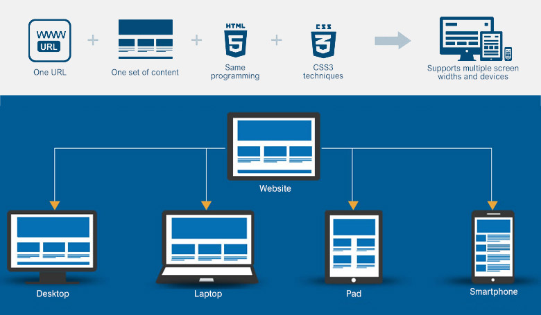
In the age of mobile prevalence, web applications are no longer restricted to viewing on desktops and notebooks. Apps cannot completely replace websites in the future either. Therefore web technologies must evolve for constant changes. With the fundamental web technology Horizon has dedicated years to develop, we strive to present UI and UX designs that are as intuitive as possible to optimized ergonomics.
We provide HTML5 for scripting, to replace Flash's restriction in displaying across devices. HTML5 is advantageous for cross-device viewing, since Firefox, Google Chrome, Opera, Safari (v 4.0 and up), Internet Explorer (v 9.0 and up) already support HTML5.
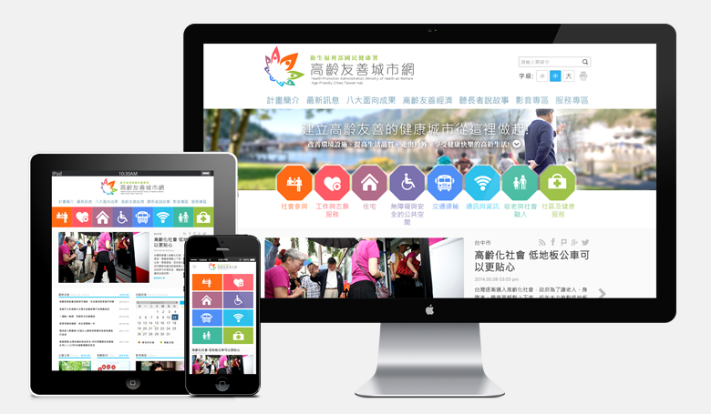
Other than upgrading mobile web technologies, we use jQuery Mobile to develop mobile versions of websites. This is the building block of Responsive Web Design, which optimizes viewing and layouts under different display widths and screen resolutions. By applying one web design scheme across all devices, all users can enjoy the best your website can offer.